Plotting results#
The outputs of parameter estimation performed by CWInPy are in the form of bilby
Result or Grid objects, for posterior samples
or posteriors evaluated on a grid, respectively. The Result object
itself has various methods for plotting the posteriors:
However, CWInPy also provides a Plot class for producing plots. This makes
use of various plotting functions from the PESummary
package [1] and corner.py [2] and can overplot
posterior results from multiple different detectors/samplers. A selection of example plots are
shown below, which are selected in Plot class using the plottype
argument:
“hist”: produce a histogram of posterior samples for a single parameter (the
kdeoption can be used to also overplot a kernel density estimate of the posterior);“kde”: produce a kernel density estimate using posterior samples for a single parameter;
“corner”: produce what is known as a corner, or triangle, plot of posterior distributions for two or more parameters in this case produced with the corner.py [2] package;
“triangle”: a different style of triangle plot (as produced by the PESummary package [1]) that can only be used for pairs of parameters;
“reverse_triangle”: another style of triangle plot (as produce by the PESummary package [1]) that has the 1D distributions to the left/below rather than to the right/above the 2D distribution plot;
“contour”: a contour plot that can be produced only for a pair of parameters.
The examples are based on the outputs of the
Multiple detectors, software injection (circular polarisation) example comparing CWInPy with
the lalpulsar_parameter_estimation_nested code [3].
Example: plotting 1D marginal posteriors#
If we have a single bilby Result containing posterior samples
saved to a file called cwinpy.hdf5 and want to plot the posterior on the \(h_0\)
parameter this can be done with:
from cwinpy.plot import Plot
plot = Plot("cwinpy.hdf5", parameters="h0", plottype="hist", kde=True)
plot.plot()
plot.save("cwinpy.png", dpi=150)
which will produce:
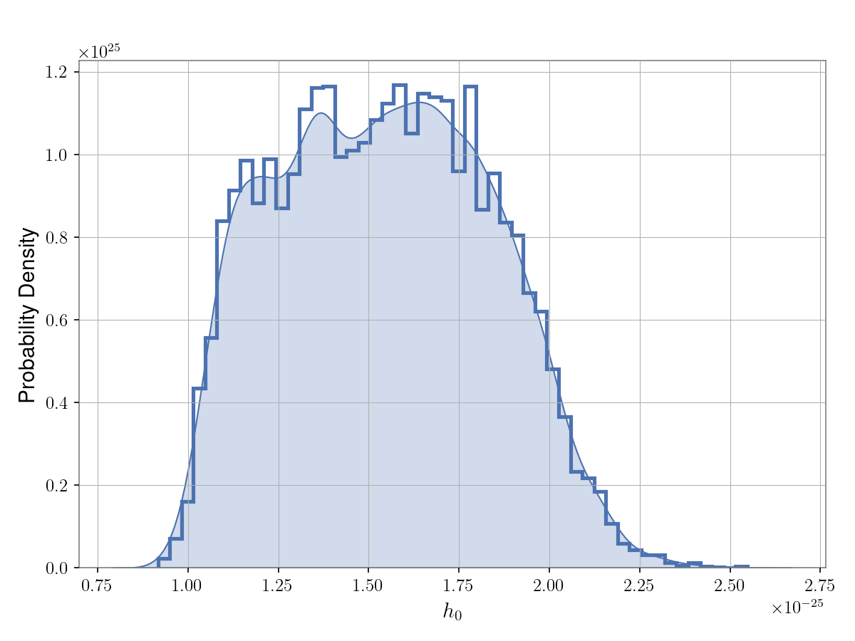
In the above code the kde=True keyword was used to also plot a kernel density estimate (KDE) of
the posterior as well as a histogram. To just plot the histogram the kde keyword could be
removed. To just plot a KDE without the histogram plottype="kde" can instead be used.
Example: over-plotting multiple 1D posteriors#
If we have multiple posterior results (e.g., from different detectors or from runs using different
samplers) that we want to compare, these can be overplotted on the same figure. To do this we can
pass a dictionary pointing to the various results. In this case we will overplot the
\(\cos{\iota}\) posterior results of running on a simulated pulsar signal using CWInPy to
produce both posterior samples and an evaluation of the posterior on a grid, and using the
lalpulsar_parameter_estimation_nested code, with:
from cwinpy.plot import Plot
plot = Plot(
    {"CWInPy": "cwinpy.hdf5", "lppen": "lppen.hdf5", "grid": "grid.json"},
    parameters="cosiota",
    plottype="kde",
    pulsar="simulation.par",
)
plot.plot()
plot.save("cwinpy.png", dpi=150)
which will produce:
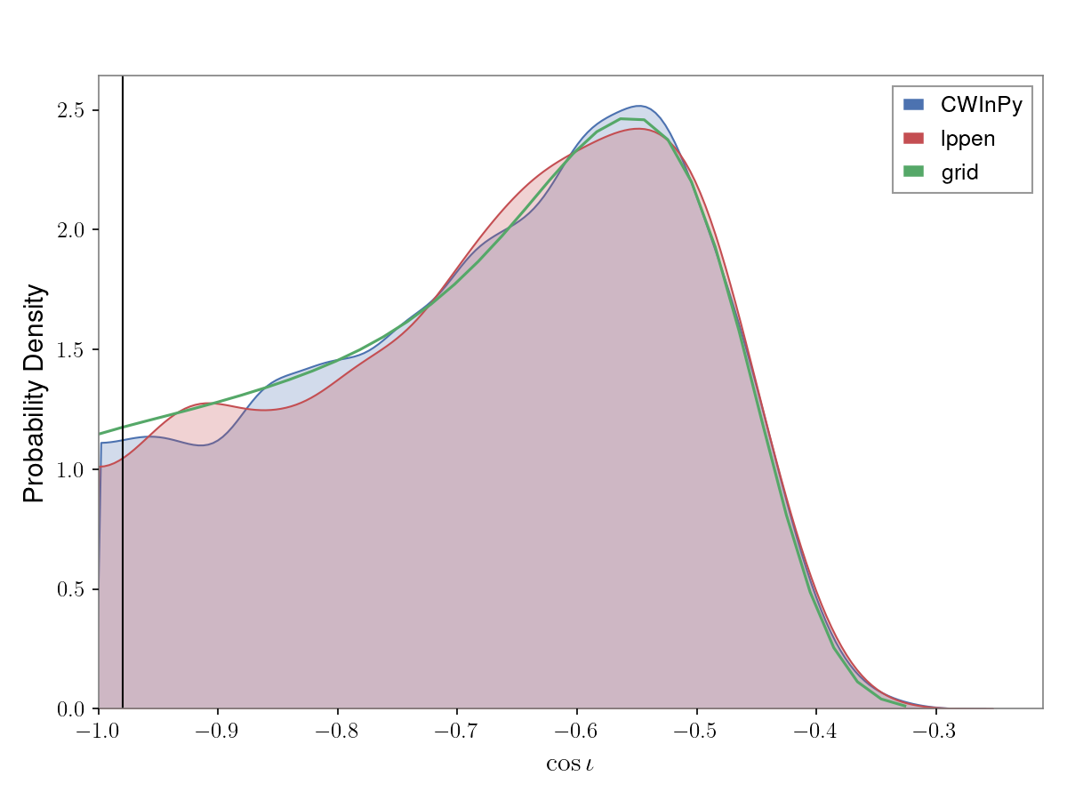
In this example the pulsar keyword has been supplied pointing to a TEMPO(2)-style pulsar
parameter file that contains the true simulated signal parameters, which are then overplotted
with a vertical black line. To not overplot the true values this argument would be removed.
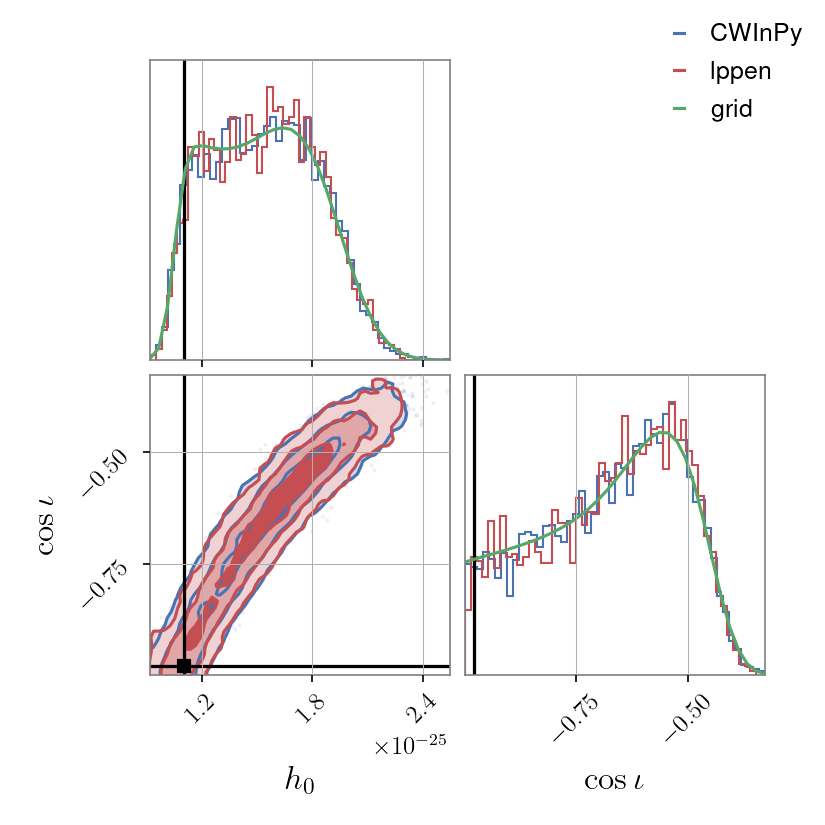
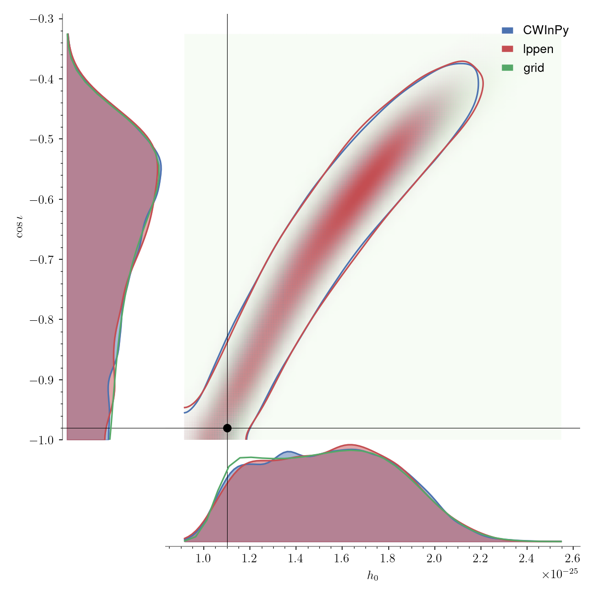
Example: plotting 2D posteriors#
We can also produce plots of pairs of parameters that include 1D marginalised posterior distributions and 2D joint posterior distributions (over-plotting multiple results as ):
Corner plot#
A “corner” plot, as produced with the corner.py [2] package, of a pair of parameters (in this case \(h_0\) versus \(\cos{\iota}\)) can be generated with, e.g.,:
from cwinpy.plot import Plot
plot = Plot(
    {"CWInPy": "cwinpy.hdf5", "lppen": "lppen.hdf5", "grid": "grid.json"},
    parameters=["h0", "cosiota"],
    plottype="corner",
    pulsar="simulation.par",
)
plot.plot()
plot.save("cwinpy.png", dpi=150)
which will produce:
Triangle plot#
A different style of corner/triangle plot can be generated with, e.g.,:
from cwinpy.plot import Plot
plot = Plot(
    {"CWInPy": "cwinpy.hdf5", "lppen": "lppen.hdf5", "grid": "grid.json"},
    parameters=["h0", "cosiota"],
    plottype="triangle",
    pulsar="simulation.par",
)
plot.plot()
plot.save("cwinpy.png", dpi=150)
and will produce:
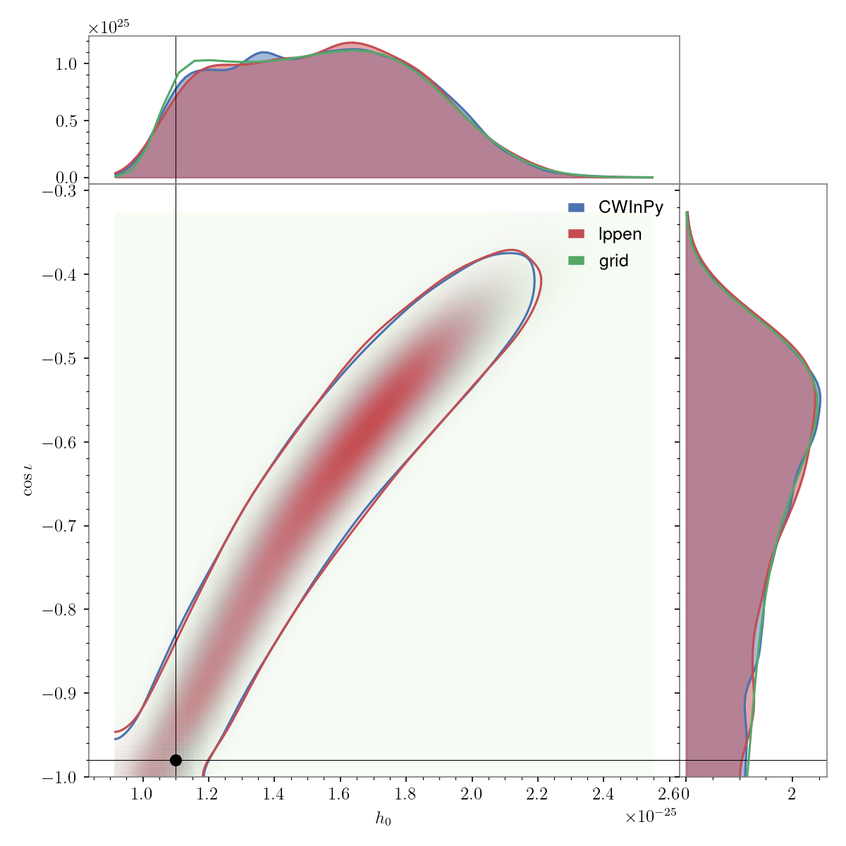
Note
This plot may take a bit of time to produce due to performing a bounded 2D kernel density estimate.
Reverse triangle plot#
Another style of corner plot, with the 1D marginal distributions shown below the 2D joint posterior plot, is a “reverse triangle” plot, which can be generated with, e.g.,:
from cwinpy.plot import Plot
plot = Plot(
    {"CWInPy": "cwinpy.hdf5", "lppen": "lppen.hdf5", "grid": "grid.json"},
    parameters=["h0", "cosiota"],
    plottype="reverse_triangle",
    pulsar="simulation.par",
)
plot.plot()
plot.save("cwinpy.png", dpi=150)
and will produce:
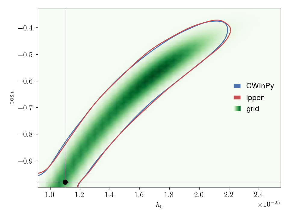
Contour plot#
A plot just containing the 2D posterior distribution, without the 1D marginal distributions, can be produced with:
from cwinpy.plot import Plot
plot = Plot(
    {"CWInPy": "cwinpy.hdf5", "lppen": "lppen.hdf5", "grid": "grid.json"},
    parameters=["h0", "cosiota"],
    plottype="contour",
    pulsar="simulation.par",
)
plot.plot()
plot.save("cwinpy.png", dpi=150)
and will produce:
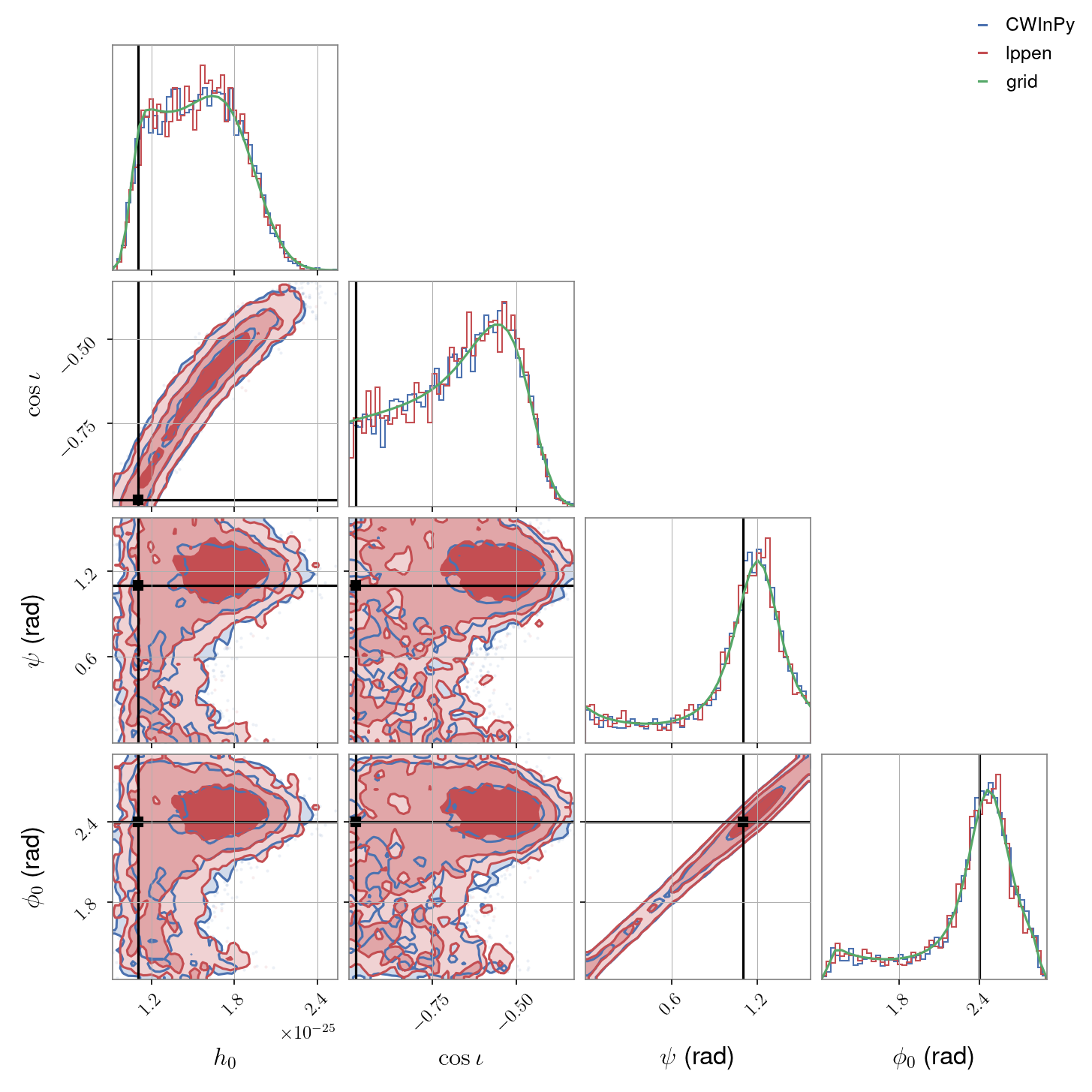
Example: plotting multiple posteriors#
If wanting to plot posteriors for more than two parameters then only the “corner” plot option can be used. If we wanted to plot \(h_0\), \(\cos{\iota}\), \(\psi\) and \(\phi_0\) we could do:
from cwinpy.plot import Plot
plot = Plot(
    {"CWInPy": "cwinpy.hdf5", "lppen": "lppen.hdf5", "grid": "grid.json"},
    parameters=["h0", "cosiota", "psi", "phi0"],
    plottype="corner",
    pulsar="simulation.par",
)
plot.plot()
plot.save("cwinpy.png", dpi=150)
to produce:
Plotting API#
- class Plot(results, parameters=None, plottype='corner', latex_labels=None, kde=False, pulsar=None, untrig=None, include_log_likelihood=False, include_log_prior=False)#
Bases:
objectA class to plot individual or joint posterior distributions using a variety of plotting functions.
Note
In the case of a “corner” plot, the
Gridresults can only be plotted together with samples from aResultobject. If plottingGridresults on their own, only single or pairs of parameters can be specified.- Parameters:
results (str, dict) – Pass the results to be plotted. This can either be in the form of a string giving the path to the results file(s), or directly passing bilby
ResultorGridobjects. If passing a dictionary, the values can be file paths,ResultorGridobjects, while the keys may be, for example, detector names if wanting to overplot parameters estimated for different detectors. The keys will be used a legend labels for the plots.parameters (list, str) – A list of the parameters that you want to plot. If requesting a single parameter this can be a string with the parameter name. If this value is
None(the default) then all parameters (except the log likelihood and log prior) will be plotted.plottype (str) – The type of plot to produce. For 1d plots, this can be: “hist” - produce a histogram of the posterior or “kde” - produce a KDE plot of the posterior. For 2d plots, this can be: “contour”, “triangle”, “reverse_triangle”, or “corner”. For higher dimensional plots only “corner” can be used.
latex_labels (dict) – A dictionary of LaTeX labels to be used for axes for the given parameters.
kde (bool) – If plotting a histogram using
"hist", set this to True to also plot the KDE. Use the"kde"plottype to only plot the KDE.pulsar (str, PulsarParameters) – A Tempo(2)-style pulsar parameter file containing the source parameters. If the requested parameters are in the parameter file, e.g., for a simulated signal, then if supplied these will be plotted with the posteriors.
untrig (str, list) – A string, or list, of parameters that are defined as the trigonometric function of another parameters. If given in the list then those parameters will be inverted, e.g., if
"cosiota"is present it will be changed to be “iota”. This only works for result samples and not grid values. Default is None.include_log_likelihood (bool) – If
parametersare not specified, and you want to include the log likelihood in the plot then set this flag to True. Default is False.include_log_prior (bool) – If
parametersare not specified, and you want to include the log prior in the plot then set this flag to True. Default is False.
- credible_interval(parameter, interval=[0.05, 0.95])#
Calculate the credible intervals for a given parameter.
- Parameters:
- Returns:
intervals – If data contains multiple result objects a dictionary will be returned containing intervals for each result. If results is a single object, a single interval list will be returned.
- Return type:
- property fig#
The
matplotlib.figure.Figureobject created for the plot.
- property injection_parameters#
A dictionary of simulated/true source parameters.
- property latex_labels#
Dictionary of LaTeX labels for each parameter.
- property parameters#
The list of parameters to be plotted.
- plot(**kwargs)#
Create the plot of the data. Different keyword arguments can be passed for the different plot options as described below. By default, a particular colour scheme will be used, which if passed results for different detectors will use the GWPy colour scheme to differentiate them.
For 1D plots using the “hist” option, keyword arguments to the
matplotlib.pyplot.hist()function can be passed using ahist_kwargsdictionary keyword argument (by default thedensityoptions, to plot the probability density, rather than bin counts will beTrue). For 1D plots using the “kde” option, arguments for the KDE can be passed using akde_kwargsdictionary keyword argument.When using the “contour” option the keyword arguments for
corner.hist2d()can be used (note that here theplot_datapointsoption will default toFalse).For “corner” plots the keyword options for
corner.corner()can be used.For “corner” plots, lines showing credible probability intervals can be set using the
quantileskeyword. For other plots, lines showing the 90% credible bounds (between the 5% and 95% percentiles) will be included if theplot_percentilekeyword is set toTrue.- Parameters:
colors (dict) – A dictionary of colour codes keyed to the keys of the
results. By default the GWpy colour scheme will be used for results keyed by GW detector prefixes. If keys are not known detector prefixes then the PESummary default color cycle will be used.grid2d (bool) – If plotting a corner plot, and overplotting Grid-based posteriors, set this to True to show the 2D Grid-based posterior densities rather than just the 1D posteriors. Default is False.
- Returns:
fig – The
matplotlib.figure.Figureobject.- Return type:
Figure
- property plottype#
The plotting function type being used.
- property pulsar#
The
PulsarParametersobject containing the source parameters.
- property results#
A dictionary of results objects, where these can be either a
ResultorGridobject. If a single result is present it will be stored in a dictionary with the default key"result".
- save(fname, **kwargs)#
An alias to run
matplotlib.figure.Figure.savefig()on the produced figure.
- savefig(fname, **kwargs)#
An alias to run
matplotlib.figure.Figure.savefig()on the produced figure.
- upper_limit(parameter, bound=0.95)#
Calculate an upper credible interval limit for a given parameter.
- Parameters:
- Returns:
upperlimit – If data contains multiple result objects a dictionary will be returned containing upper limits for each result. If data is a single object, a single upper limit will be returned.
- Return type: